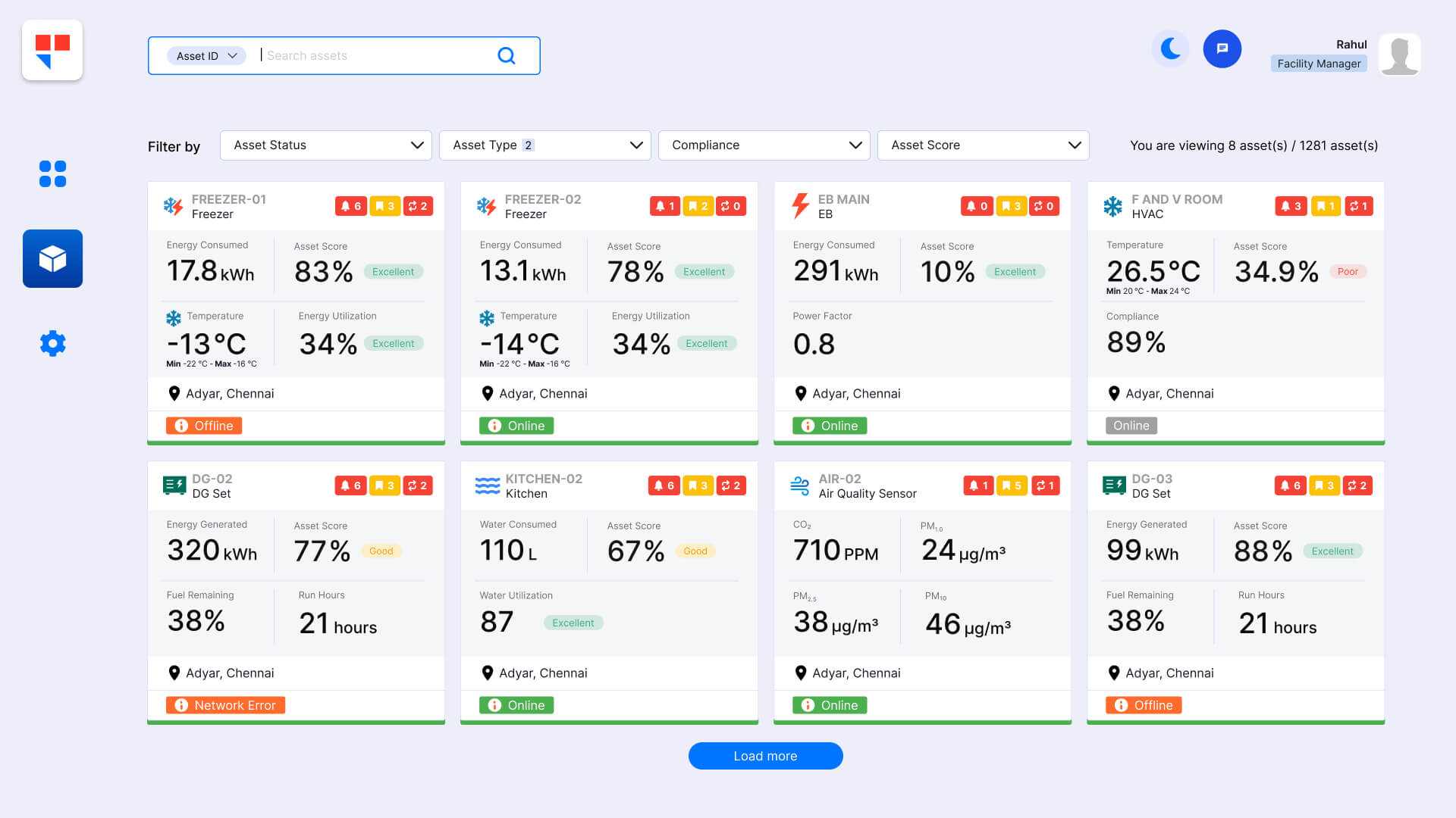
The asset listing screen is a core part of the IoT dashboard used daily by store managers, technicians, and operations teams to monitor and act on hundreds of assets. However, the original design was cluttered, visually rigid, and unable to handle real-world data complexity. Long numeric values broke the layout, essential metrics were hard to spot, and the same static card layout served all users, regardless of their roles or needs.
Asset List Redesign - Creating a Scalable, Customisable View for Diverse User Needs
category
Product Designrole
Product Designer - led the end-to-end redesign while guiding a team of 2 supporting designers.deliverables
User Research & UX Strategy, UI/UX Design, Prototypingtimeline
Jun 2024 - 2 Weeksthe
challenge
Drag this
users
Technicians - focused on real-time operational data like temperature, consumption, status, and fault flags.
Store Managers - preferred performance summaries such as month-to-date consumption, estimated costs, asset health, etc.
Ops Teams & Admins - needed a balanced overview and control capabilities across multiple sites.
role
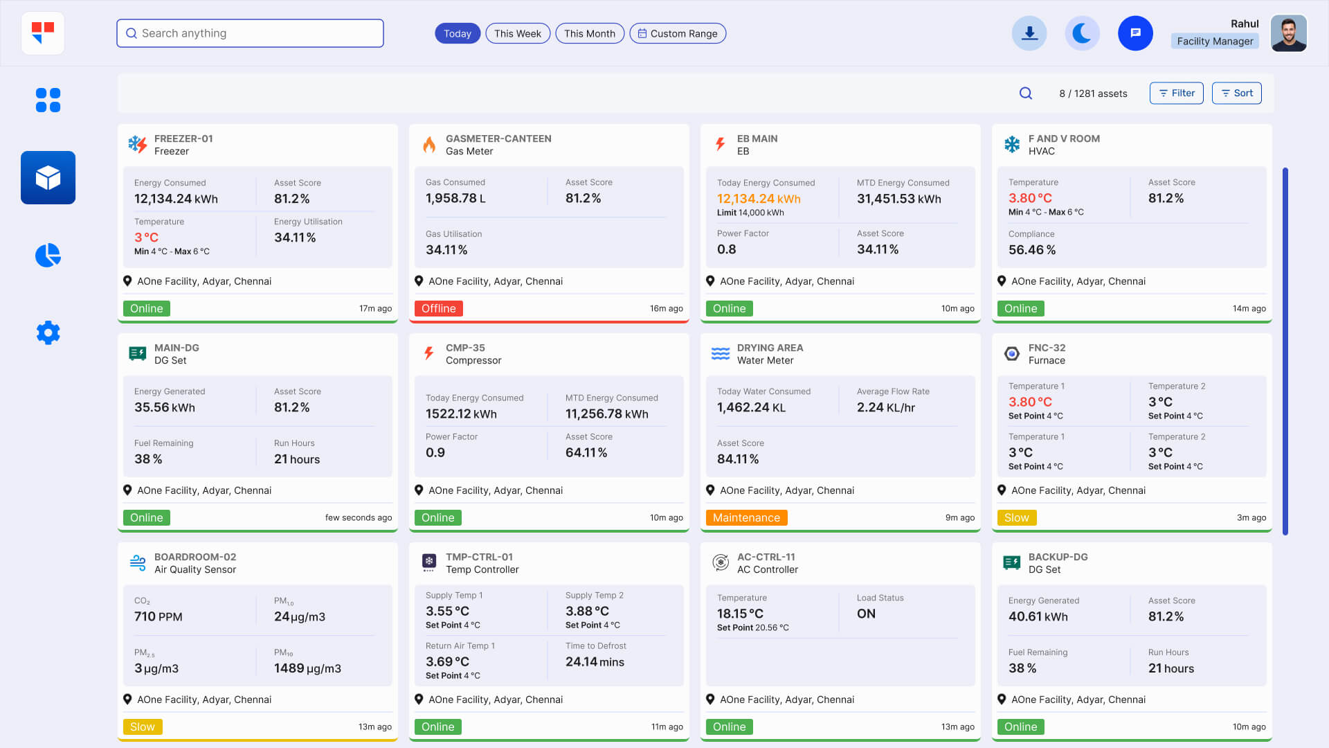
Led the redesign of the asset list experience to make it scalable, flexible, and role-aware. The new version supported dynamic metric selection, allowing users to personalise what data they want to see per asset type, be it real-time temperature or month-to-date consumption. The layout was restructured for better visual hierarchy, legibility, and performance with large datasets.
process & exploration
To initiate the redesign, we conducted internal feedback sessions and usage analysis across different user roles. A recurring theme emerged: the static card layout failed to surface relevant insights for different stakeholders. For instance, technicians needed access to real-time operational data such as temperature, energy consumption, and fault status, while managers preferred derived metrics like month-to-date consumption, cost estimates, and aggregated health scores.
We also introduced role-based presets while still allowing manual customisation, ensuring both speed and control.
final solution
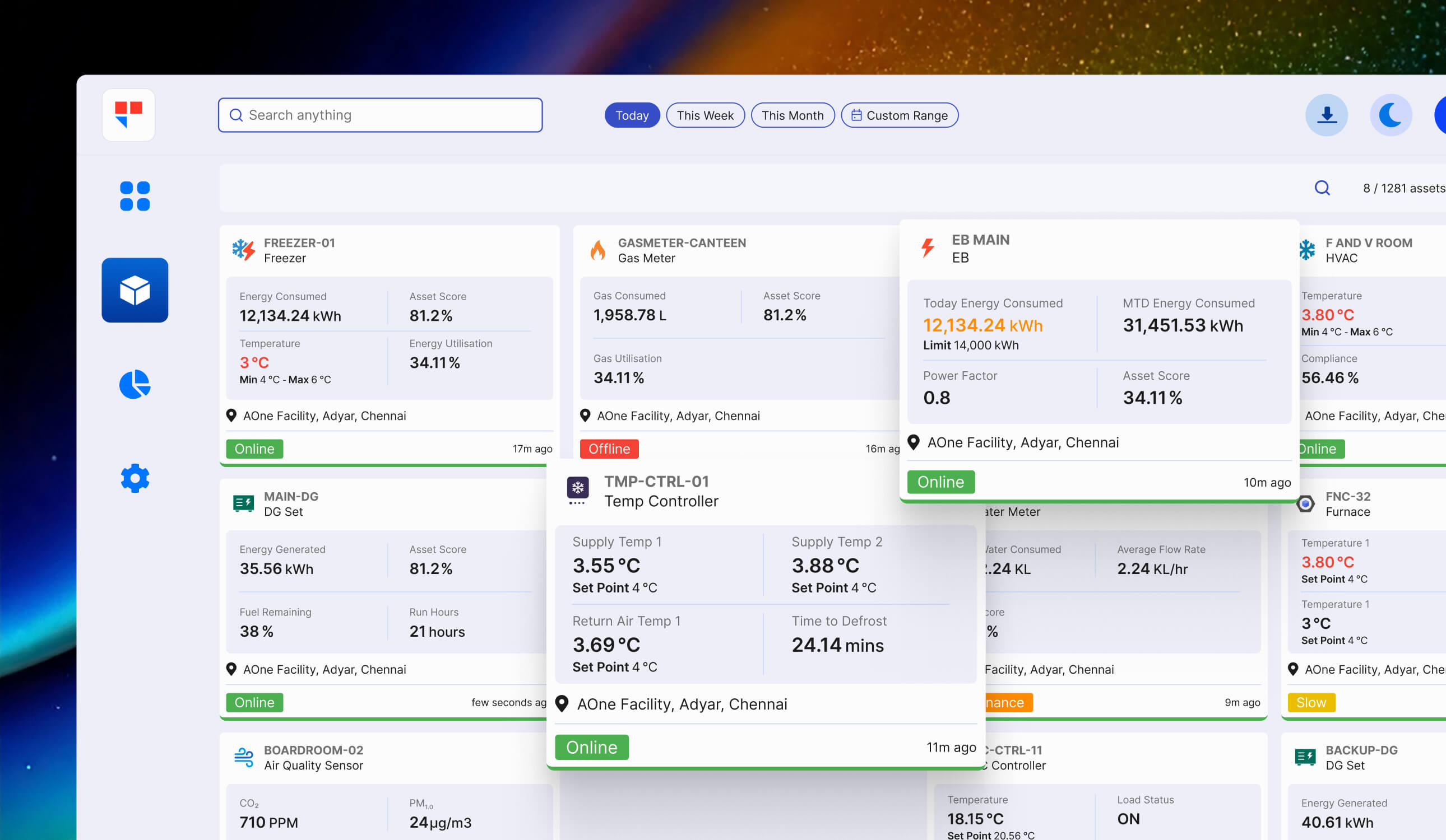
The final design introduced a modular, dynamic asset list that catered to the needs of multiple user roles without compromising clarity or performance. Each card displayed only the metrics selected by the user, with full control over both the content and order of those metrics.
With this release, we also implemented a generic filter component which allows in-page search, filter, sort and other actions.
The solution ensured continuity in the platform while significantly enhancing usability and personalisation. The system also laid the groundwork for future modules to follow a similar dynamic approach.
The redesigned asset list received strong internal adoption and user satisfaction during phased rollouts
- Users reported faster scanning and decision-making due to tailored views.
- The platform became more future-proof, supporting new asset types and metrics without requiring UI overhauls.
- Feedback from early testers noted the system was “visibly cleaner, more relevant, and easier to work with” compared to the legacy version.
40%↓
reduction in time spent scanning asset data
25%↑
daily engagement